BRAND
HOSPET
PROJECT
Building Hospet: A Thoughtful Dashboard for Pet Hospice Services
SUMMARY
Hospet is a dashboard designed to streamline hospice and end-of-life pet care, making coordination effortless for providers and pet owners.
ROLE
UX Designer
Web Designer
BRAND
HOSPET
PROJECT
Building Hospet: A Thoughtful Dashboard for Pet Hospice Services
SUMMARY
Hospet is a dashboard designed to streamline hospice and end-of-life pet care, making coordination effortless for providers and pet owners.
ROLE
UX Designer
Web Designer
BRAND
HOSPET
PROJECT
Building Hospet: A Thoughtful Dashboard for Pet Hospice Services
SUMMARY
Hospet is a dashboard designed to streamline hospice and end-of-life pet care, making coordination effortless for providers and pet owners.
ROLE
UX Designer
Web Designer
Overview
Overview
Overview
Hospet is a dashboard platform designed for pet hospice and end-of-life care management. This project was part of a contest where the goal was to revamp the existing dashboard and enhance its usability for digital business operations. The original design provided only a basic structure, lacking modern dashboard aesthetics and intuitive user flow. My approach focused on improving clarity, functionality, and visual appeal to create a seamless user experience.
Hospet is a dashboard platform designed for pet hospice and end-of-life care management. This project was part of a contest where the goal was to revamp the existing dashboard and enhance its usability for digital business operations. The original design provided only a basic structure, lacking modern dashboard aesthetics and intuitive user flow. My approach focused on improving clarity, functionality, and visual appeal to create a seamless user experience.
Hospet is a dashboard platform designed for pet hospice and end-of-life care management. This project was part of a contest where the goal was to revamp the existing dashboard and enhance its usability for digital business operations. The original design provided only a basic structure, lacking modern dashboard aesthetics and intuitive user flow. My approach focused on improving clarity, functionality, and visual appeal to create a seamless user experience.
Problems
Problems
Problems
When I first encountered the original Hospet dashboard, I immediately noticed its limitations. The design resembled a simple, scrollable layout—more akin to a PowerPoint presentation than an interactive dashboard. As I explored further, I found it difficult to pinpoint the platform’s core features. The key functionalities were buried under layers of information, making it challenging for users to quickly understand what Hospet offered.
When I first encountered the original Hospet dashboard, I immediately noticed its limitations. The design resembled a simple, scrollable layout—more akin to a PowerPoint presentation than an interactive dashboard. As I explored further, I found it difficult to pinpoint the platform’s core features. The key functionalities were buried under layers of information, making it challenging for users to quickly understand what Hospet offered.
When I first encountered the original Hospet dashboard, I immediately noticed its limitations. The design resembled a simple, scrollable layout—more akin to a PowerPoint presentation than an interactive dashboard. As I explored further, I found it difficult to pinpoint the platform’s core features. The key functionalities were buried under layers of information, making it challenging for users to quickly understand what Hospet offered.
Additionally, the general look did not have the style and user-friendliness expected in today's screens. There was no clear emphasis on the platform’s strengths, and the absence of a structured visual hierarchy led to confusion. Most importantly, Hospet’s best-selling feature—its ability to help users record and manage pet health data—was not highlighted effectively.
Additionally, the general look did not have the style and user-friendliness expected in today's screens. There was no clear emphasis on the platform’s strengths, and the absence of a structured visual hierarchy led to confusion. Most importantly, Hospet’s best-selling feature—its ability to help users record and manage pet health data—was not highlighted effectively.
Additionally, the general look did not have the style and user-friendliness expected in today's screens. There was no clear emphasis on the platform’s strengths, and the absence of a structured visual hierarchy led to confusion. Most importantly, Hospet’s best-selling feature—its ability to help users record and manage pet health data—was not highlighted effectively.
This raised a fundamental question:
This raised a fundamental question:
This raised a fundamental question:
How can we clarify the information about Hospet’s core features while ensuring users can easily record and manage pet data in a visually engaging and structured way?
Design Solution Process
Design Solution Process
Design Solution Process
Understanding the Issues and Setting the Foundation
Understanding the Issues and Setting the Foundation
Understanding the Issues and Setting the Foundation
When I first analyzed the dashboard, I imagined myself as a user navigating through the platform. The original layout felt outdated and inefficient, requiring users to scroll endlessly to find critical information. There was no clear emphasis on the platform’s core strengths, making it difficult for users to grasp its true value. This realization led me to the core question: How could I present Hospet’s features in a way that was intuitive, modern, and engaging?
When I first analyzed the dashboard, I imagined myself as a user navigating through the platform. The original layout felt outdated and inefficient, requiring users to scroll endlessly to find critical information. There was no clear emphasis on the platform’s core strengths, making it difficult for users to grasp its true value. This realization led me to the core question: How could I present Hospet’s features in a way that was intuitive, modern, and engaging?
When I first analyzed the dashboard, I imagined myself as a user navigating through the platform. The original layout felt outdated and inefficient, requiring users to scroll endlessly to find critical information. There was no clear emphasis on the platform’s core strengths, making it difficult for users to grasp its true value. This realization led me to the core question: How could I present Hospet’s features in a way that was intuitive, modern, and engaging?
Structuring the Experience
Structuring the Experience
Structuring the Experience
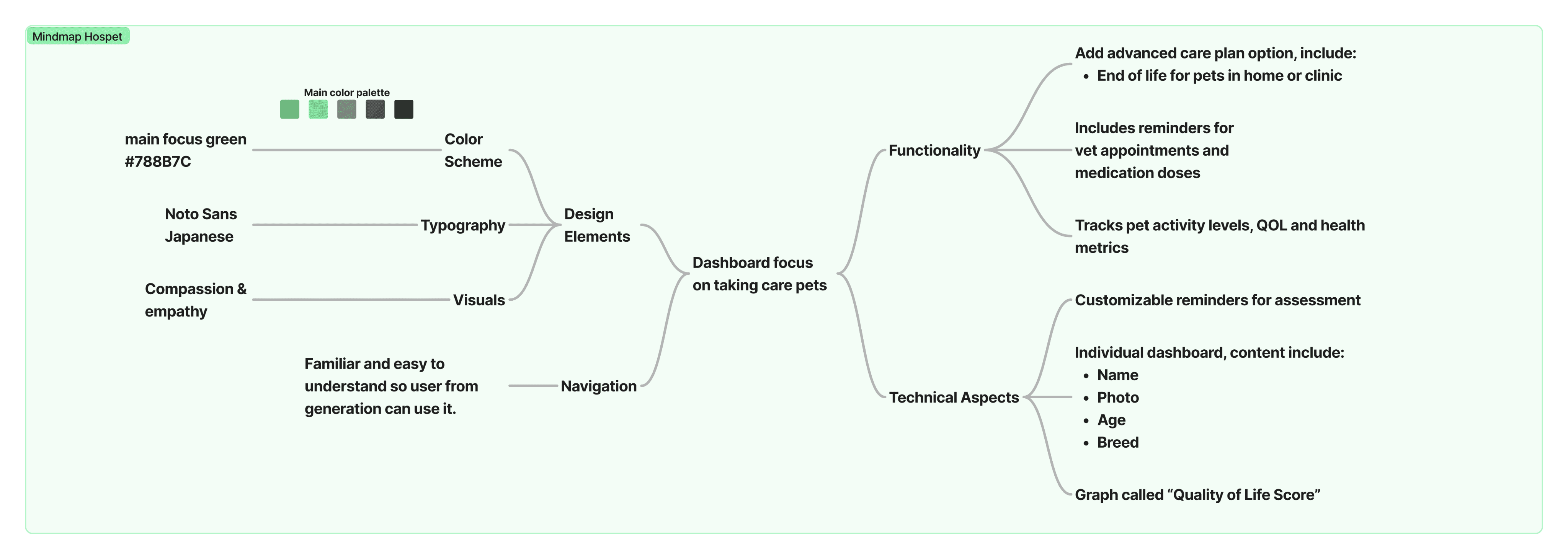
To solve this, I began by crafting a mind map, outlining the elements necessary to redefine the dashboard. The first priority was establishing a clear visual hierarchy, ensuring that the most essential features were prominent and accessible. Navigation needed to feel familiar and effortless, so I refined the structure to be both intuitive and accommodating to users of all generations. At the same time, I considered future scalability, designing the system in a way that would allow new features to integrate seamlessly.
To solve this, I began by crafting a mind map, outlining the elements necessary to redefine the dashboard. The first priority was establishing a clear visual hierarchy, ensuring that the most essential features were prominent and accessible. Navigation needed to feel familiar and effortless, so I refined the structure to be both intuitive and accommodating to users of all generations. At the same time, I considered future scalability, designing the system in a way that would allow new features to integrate seamlessly.
To solve this, I began by crafting a mind map, outlining the elements necessary to redefine the dashboard. The first priority was establishing a clear visual hierarchy, ensuring that the most essential features were prominent and accessible. Navigation needed to feel familiar and effortless, so I refined the structure to be both intuitive and accommodating to users of all generations. At the same time, I considered future scalability, designing the system in a way that would allow new features to integrate seamlessly.
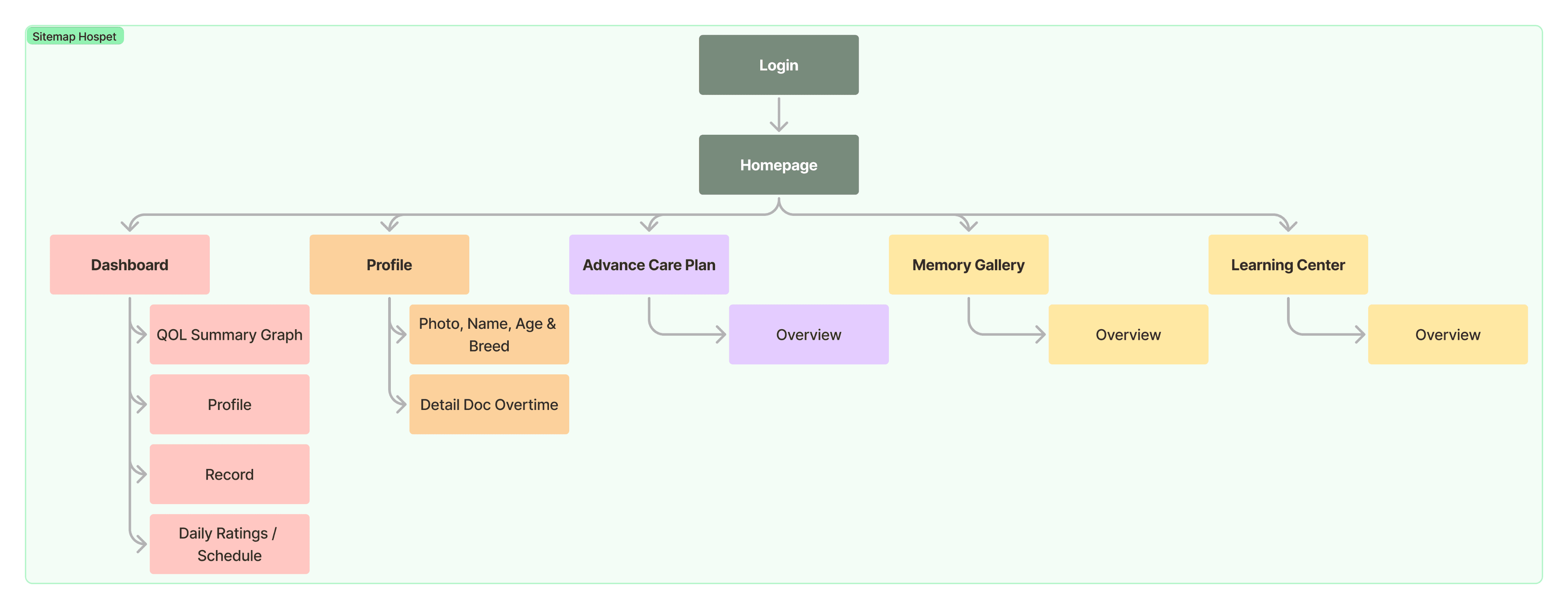
After defining the core elements, I developed a sitemap to organize content efficiently. This step helped ensure a logical and structured navigation flow, preventing information overload. By arranging content in a digestible format, users could quickly find the features they needed without unnecessary friction.
After defining the core elements, I developed a sitemap to organize content efficiently. This step helped ensure a logical and structured navigation flow, preventing information overload. By arranging content in a digestible format, users could quickly find the features they needed without unnecessary friction.
After defining the core elements, I developed a sitemap to organize content efficiently. This step helped ensure a logical and structured navigation flow, preventing information overload. By arranging content in a digestible format, users could quickly find the features they needed without unnecessary friction.
Bringing the Design to Life
Bringing the Design to Life
Bringing the Design to Life
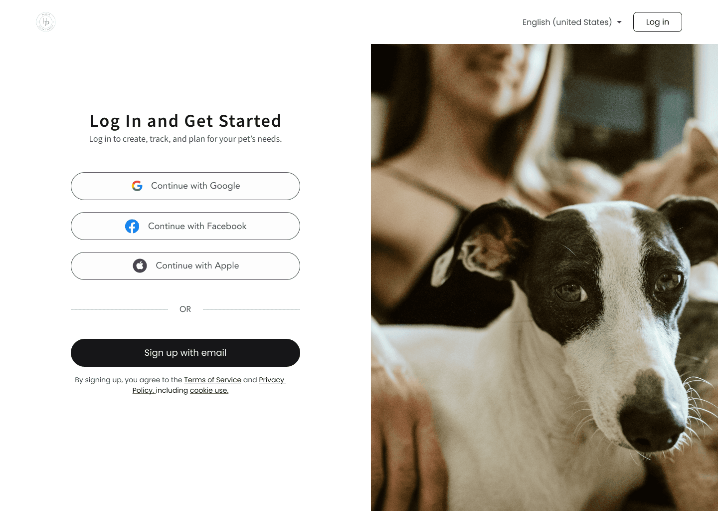
Once the foundation was set, I transitioned into the visual design phase. Hospet is a platform that deals with sensitive and emotional matters, so I wanted the aesthetics to reflect compassion and professionalism. I selected a color palette that evoked trust and warmth, paired with a modern typography set that improved readability and clarity. Additionally, I incorporated user-friendly icons and graphics to enhance engagement and make navigation more intuitive.
Once the foundation was set, I transitioned into the visual design phase. Hospet is a platform that deals with sensitive and emotional matters, so I wanted the aesthetics to reflect compassion and professionalism. I selected a color palette that evoked trust and warmth, paired with a modern typography set that improved readability and clarity. Additionally, I incorporated user-friendly icons and graphics to enhance engagement and make navigation more intuitive.
Once the foundation was set, I transitioned into the visual design phase. Hospet is a platform that deals with sensitive and emotional matters, so I wanted the aesthetics to reflect compassion and professionalism. I selected a color palette that evoked trust and warmth, paired with a modern typography set that improved readability and clarity. Additionally, I incorporated user-friendly icons and graphics to enhance engagement and make navigation more intuitive.
Creating a Cohesive System
Creating a Cohesive System
Creating a Cohesive System
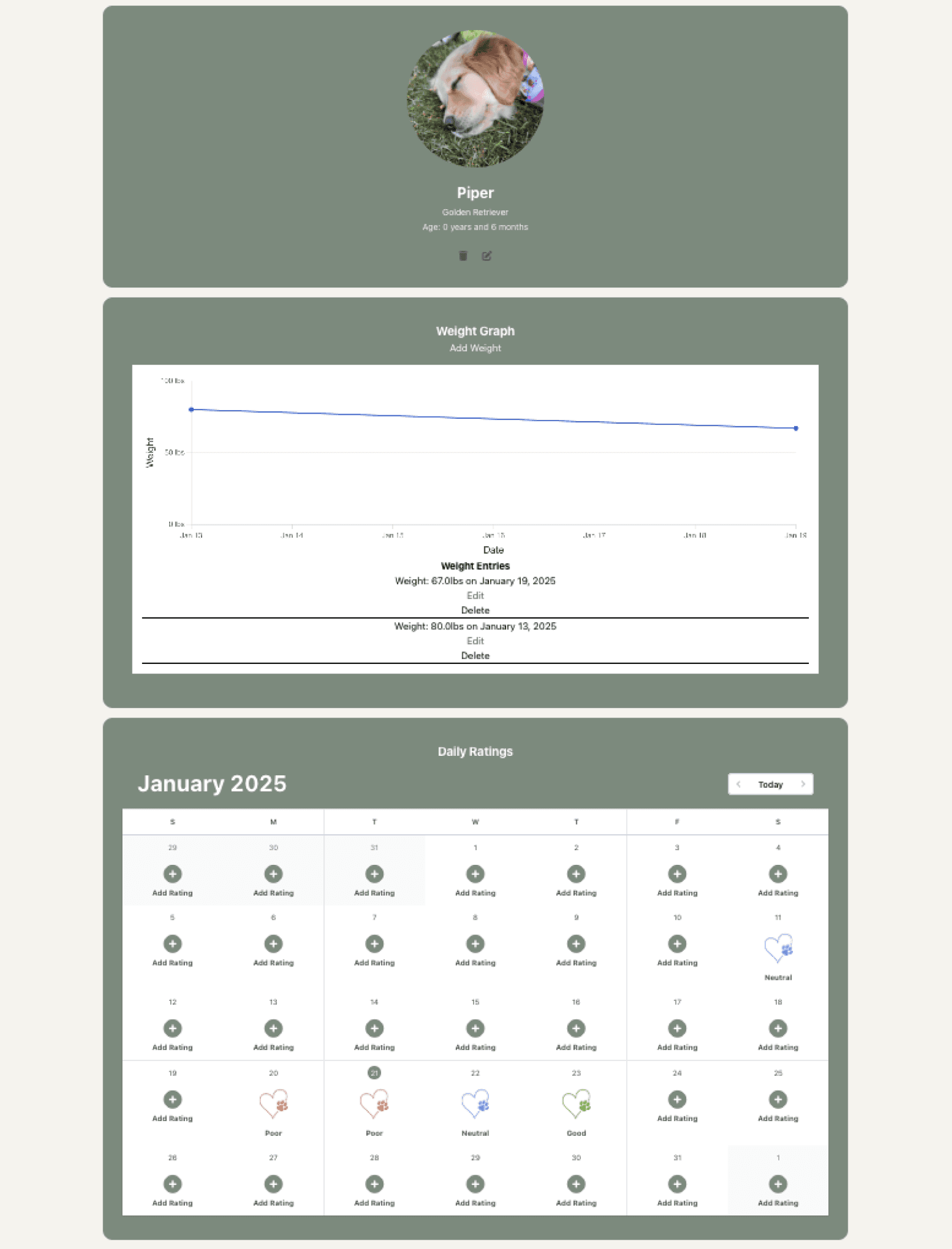
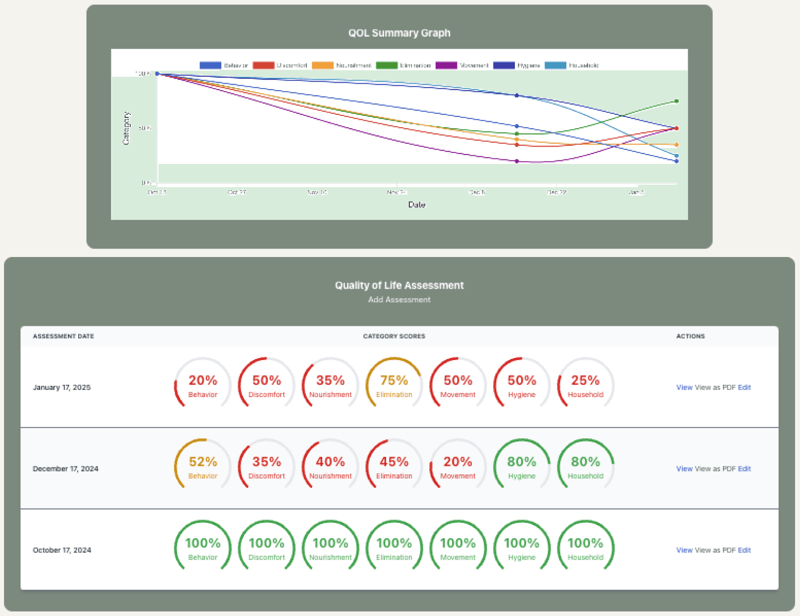
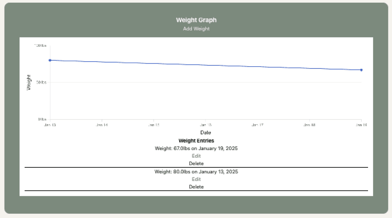
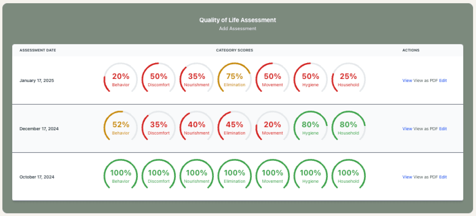
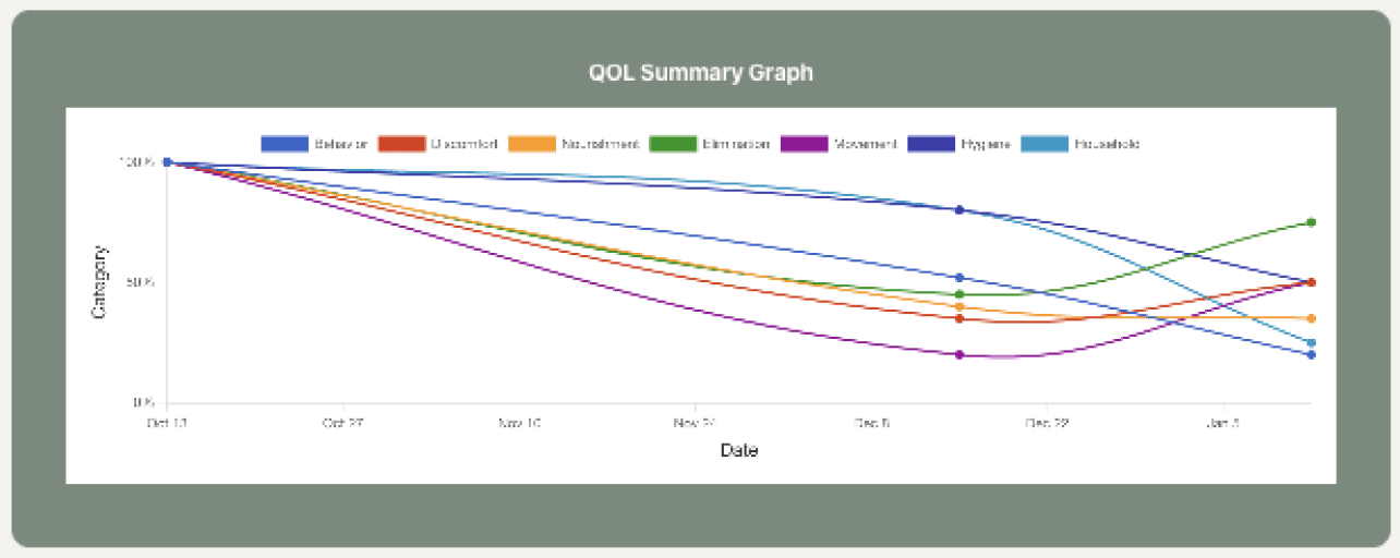
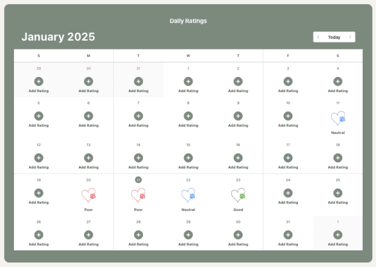
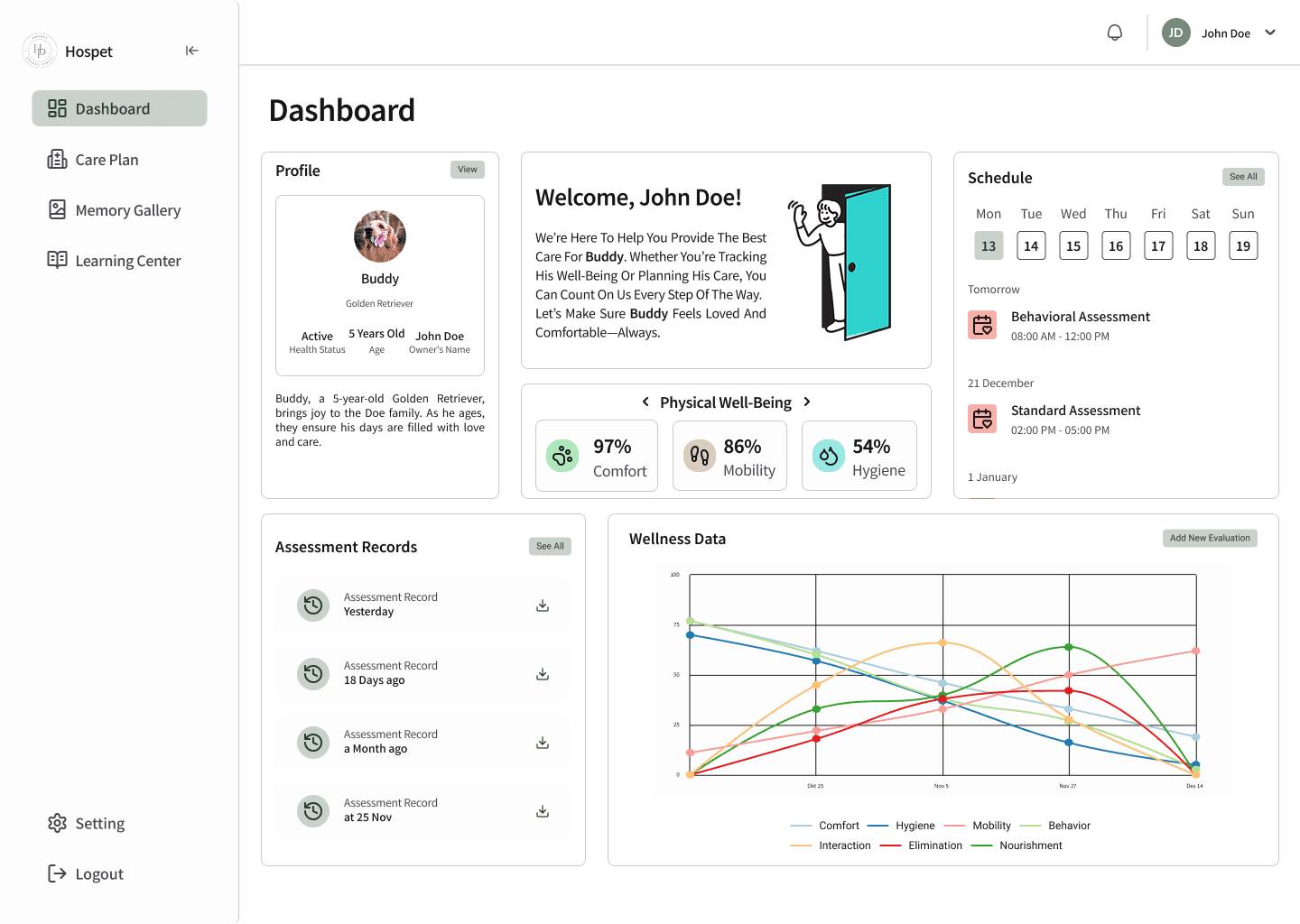
To ensure a seamless experience, I developed a design system that unified all elements. Every component was designed to be scalable and modular, providing flexibility for future updates. I aligned UI elements with best UX practices, ensuring accessibility and ease of use. Data visualization techniques were also incorporated to help users track pet activity levels, quality of life, and health status efficiently.
To ensure a seamless experience, I developed a design system that unified all elements. Every component was designed to be scalable and modular, providing flexibility for future updates. I aligned UI elements with best UX practices, ensuring accessibility and ease of use. Data visualization techniques were also incorporated to help users track pet activity levels, quality of life, and health status efficiently.
To ensure a seamless experience, I developed a design system that unified all elements. Every component was designed to be scalable and modular, providing flexibility for future updates. I aligned UI elements with best UX practices, ensuring accessibility and ease of use. Data visualization techniques were also incorporated to help users track pet activity levels, quality of life, and health status efficiently.
The Final Result
The Final Result
The Final Result
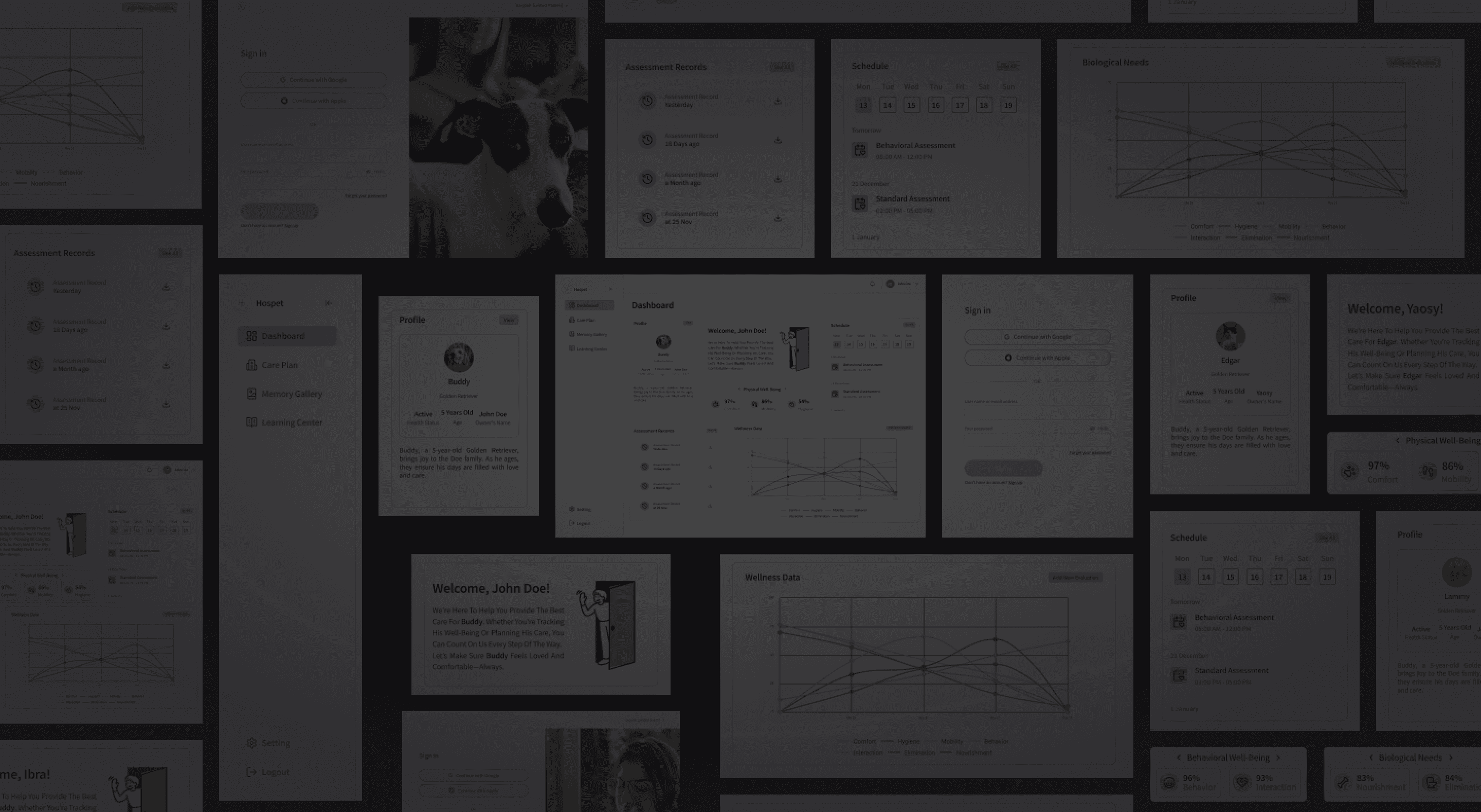
The final prototype showcased a modern, structured dashboard that enhanced both functionality and aesthetics. The best-selling features were now at the forefront, allowing users to easily access the most critical tools. Navigation was simplified, ensuring users could move through the platform effortlessly. The result was a dashboard that not only served its practical purpose but also provided a visually engaging and emotionally considerate experience.
The final prototype showcased a modern, structured dashboard that enhanced both functionality and aesthetics. The best-selling features were now at the forefront, allowing users to easily access the most critical tools. Navigation was simplified, ensuring users could move through the platform effortlessly. The result was a dashboard that not only served its practical purpose but also provided a visually engaging and emotionally considerate experience.
The final prototype showcased a modern, structured dashboard that enhanced both functionality and aesthetics. The best-selling features were now at the forefront, allowing users to easily access the most critical tools. Navigation was simplified, ensuring users could move through the platform effortlessly. The result was a dashboard that not only served its practical purpose but also provided a visually engaging and emotionally considerate experience.

Summary
Summary
Summary
The Hospet dashboard revamp aimed to transform a basic and outdated design into a modern, user-friendly platform. By focusing on information clarity, navigation improvements, and an empathetic visual style, the new design enhances the user experience while maintaining flexibility for future enhancements. The result is a dashboard that not only meets the functional needs of pet care professionals but also provides a seamless and engaging digital experience.
The Hospet dashboard revamp aimed to transform a basic and outdated design into a modern, user-friendly platform. By focusing on information clarity, navigation improvements, and an empathetic visual style, the new design enhances the user experience while maintaining flexibility for future enhancements. The result is a dashboard that not only meets the functional needs of pet care professionals but also provides a seamless and engaging digital experience.
The Hospet dashboard revamp aimed to transform a basic and outdated design into a modern, user-friendly platform. By focusing on information clarity, navigation improvements, and an empathetic visual style, the new design enhances the user experience while maintaining flexibility for future enhancements. The result is a dashboard that not only meets the functional needs of pet care professionals but also provides a seamless and engaging digital experience.
LUTHFI
PRATAMA
Design is a journey, and I take it one step at a time—crafting each project with focus, intention, and precision. Every detail matters, ensuring that each design is not just complete, but truly refined before moving forward.